In the world of high-end digital art, color is more than an aesthetic choice—it is a technical delivery system for emotion.
At KOSAKI DESIGN ART, we believe that an ordinary room can be transformed into a sanctuary of “Bionic Elegance” through the strategic application of color theory.
For our community of technology enthusiasts and global travelers, understanding the logic behind the palette is the first step toward curating a living space that feels both sophisticated and alive.
This article explores the “Logic of Chromatics”—the intersection where the physics of light meets the psychology of the human heart. ✨
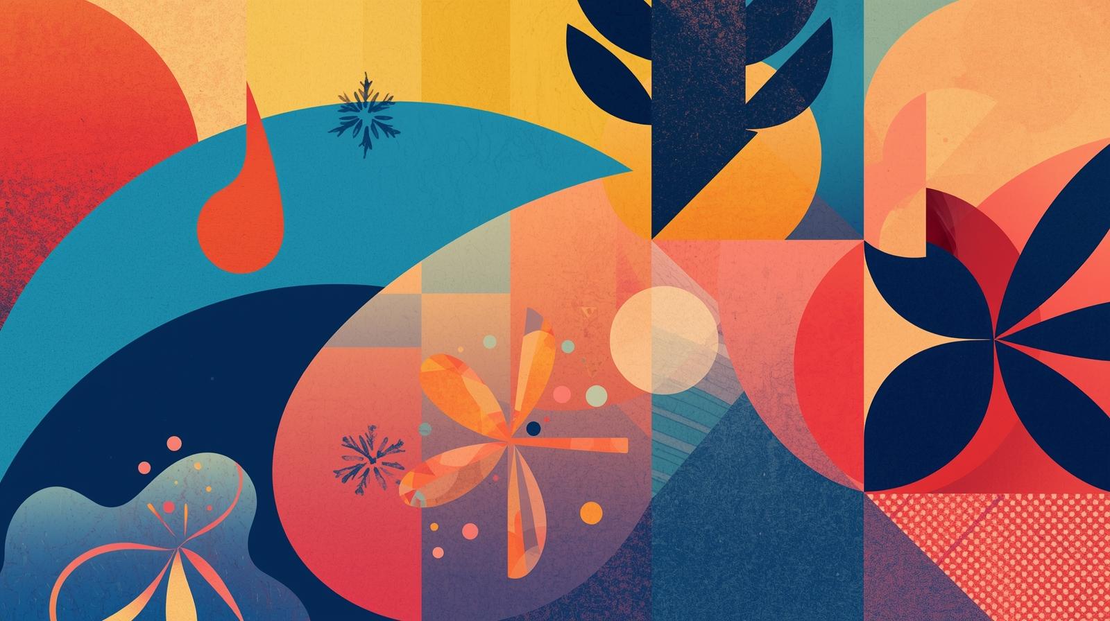
1. The Architecture of the Color Wheel
Every masterpiece begins with an understanding of the Color Wheel.
While the basics are taught in primary school, the engineering of high-end art requires a deeper look at the “Harmonic Intervals” between hues.
For the bionic designer, the wheel is a map of emotional possibilities.
- Complementary Logic: Using colors from opposite sides of the wheel (e.g., Deep Blue and Golden Orange) creates a “Visual Spark.” This contrast generates energy and makes a piece pop as a centerpiece.
- Analogous Harmony: Selecting colors that sit side-by-side (e.g., Teal, Blue, and Indigo) creates a sense of peace and professional cohesion. This is the logic of a quiet evening in a luxury hotel.
- Triadic Precision: Using three colors spaced equally around the wheel provides a vibrant, balanced palette that feels complex and “Full-Spectrum.”
2. The Psychology of the Palette: Engineering Mood
Colors are not neutral; they are biological triggers. For our audience—men who value the focus of a trading floor or the serenity of a mountain hike—choosing the right hue is about choosing the right mindset.
- The Stability of Blue: Represents intelligence, precision, and the infinite horizon. In a high-tech home office, blue reduces heart rates and enhances mental clarity.
- The Warmth of Gold and Ochre: These colors evoke heritage, luxury, and the glow of a sunset in a foreign land. They provide the “Human Touch” to a digital space.
- The Purity of White and Slate: Essential for “Ma” (the void), these neutrals provide the breathing room that allows the “Digital Flower” to bloom.
3. The Technical Edge: Bit Depth and Color Gamuts
As a tech-savvy collector, you know that the “Quality” of color is limited by the hardware that displays it.
This is where IT engineering enhances art. At KOSAKI DESIGN, we prepare our files for the most advanced displays in the world.
High-end digital art requires an understanding of Display P3 and 10-bit color depth. Standard images (8-bit) can only display 16.7 million colors, which often leads to “banding” in gradients.
Our bionic workflow utilizes 10-bit color, allowing for over 1 billion colors. This ensures that the subtle shift from a midnight blue to a storm gray is perfectly smooth, mimicking the complexity of the physical world.
4. Spotlight: “Typhoon Eye” — The Centripetal Force of Color
To see the logic of emotional impact in action, we analyze one of our most intense pieces: Typhoon Eye (KDA000039).
The Concept: This piece represents the ultimate contrast—the violent energy of a storm and the absolute stillness at its center. This duality is captured entirely through color engineering.
Color Engineering:
- The Core: We used an almost blinding Luminous White at the center. In color theory, white at the center of a dark composition acts as a “Visual Magnet,” drawing the viewer’s eye into the “Ma.”
- The Swirl: The outer layers use a high-contrast mix of Electric Indigo and Deep Cobalt. By using “Cold” colors, we emphasize the “Hard Logic” of the machine and the raw power of the weather.
- The Impact: On the KOSAKI DESIGN ART SHOP, “Typhoon Eye” is chosen by collectors who want a piece that radiates power. It is designed to sit in a room with minimal lighting, allowing the digital “glow” of the blues to define the atmosphere.
5. Designing Your Room: Managing Ambient Light
Art does not exist in a vacuum. The emotional impact of the color in your digital art depends on the Color Temperature (K) of your room’s lighting. 🌿
- 6500K (Daylight): Enhances the blues and whites of a piece like “Typhoon Eye,” making it feel crisp and clinical. Perfect for productivity.
- 3000K (Warm White): Will “mute” the blues but enhance the warmth of the colors. If your art features gold or silver waves, this lighting will make them feel more luxurious and “homely.”
6. Conclusion: The Final Bloom
Color is the soul of the digital flower. By understanding the wheel, the psychology of hues, and the technical gamuts of our screens, we can engineer a lifestyle that is both cutting-edge and deeply human.
At KOSAKI DESIGN ART, our mission is to ensure that the colors we choose for you are not just pixels—they are the seeds of a new, elegant atmosphere in your home.
The “Typhoon Eye” is waiting to bring its powerful, quiet energy to your wall. Are you ready to master the storm? 🌿☕️