Typography is often the invisible hero of digital art and design.
Recently, where the “Attention Economy” moves at the speed of a fiber-optic pulse, the way we present information is just as critical as the information itself.
For the Bionic Artist, typography is not merely choosing a font; it is a sophisticated bridge between IT Logic (processing speed and legibility) and Traditional Soul (aesthetic expression).
At KOSAKI DESIGN ART, we view typography as the “Code of Communication”—a structured system that guides the viewer through the narrative of a masterpiece.
To reach the gold standard of art sales per month, an artist must respect the viewer’s cognitive experience.
This article explores the engineering required to make text both a functional tool and an evocative work of art, ensuring your digital layouts carry the weight of professional craftsmanship.
1. The Cognitive Science of Reading: How We Process Type
Before we can discuss style, we must understand the biological “Logic of Scanning.”
Human eyes do not move smoothly across a line of text; they move in a series of jumps called Saccades, punctuated by brief pauses known as Fixations.
The goal of high-end typography is to minimize the effort required for these jumps, allowing the brain to absorb data with zero friction.
The “Ma” of Type: Kerning and Leading
In Japanese aesthetics, Ma (the void) is essential for meaning.
In typography, this manifests as Kerning (the space between individual letters) and Leading (the vertical space between lines).
If these spaces are too tight, the eye becomes exhausted; if they are too loose, the brain struggles to connect the words.
By engineering the perfect amount of white space, we reduce the cognitive load, creating a comfortable reading experience even on a cluttered digital screen.
Serif vs. Sans-Serif: The Technical Choice
The debate between Serif and Sans-Serif is one of engineering.
Serifs—the small “feet” at the end of strokes—were historically designed to help the eye follow a line in long-form print. However, in the digital landscape, high-resolution Sans-Serif fonts often provide “cleaner” data for rapid scanning.
The bionic choice is often a Hybrid Logic: using authoritative Serifs for titles to evoke tradition, and clean Sans-Serifs for body text to ensure maximum readability.
2. Engineering Readability: The IT Approach to Layout
Readability is a metric that can be optimized through design logic. At our atelier, we apply the same rigorous standards to our typography that we do to our upscaling algorithms.
Hierarchy of Information
A successful layout acts as a map. By manipulating weight, size, and color, we create a Visual Path.
The viewer should know intuitively what to read first, second, and last.
This hierarchy is the difference between a random assortment of words and a professionally engineered “Information Architecture.”
Responsive Typography and CSS Logic
Modern typography must be fluid. We use advanced CSS functions like clamp() to ensure that our titles look as sophisticated on a mobile device as they do on a 4K gallery monitor.
This ensures that the “Style” of the brand remains consistent across the entire digital ecosystem, regardless of the hardware the collector is using.
3. Spotlight: “Taroko Gorge” – The Marble Cathedral of Taiwan
To see this science in action, we analyze one of our most powerful pieces: Taroko Gorge (KDA000011) — The Marble Cathedral of Taiwan.
The Typographic Logic of the Gorge
The Taroko Gorge is defined by its sheer verticality and the rugged power of marble cliffs. In the presentation of this work, we chose a High-Contrast Serif for the title.
The sharp, vertical strokes of the letterforms mimic the steep, carved faces of the canyon. This is “Typography as Texture”—where the font itself echoes the subject matter.
Alignment with the Silver Ratio
The text for “Taroko Gorge” is not placed randomly. It is aligned along the Silver Ratio (1:1.414), which governs the composition of the artwork.
By anchoring the text to the same geometric grid as the mountain ridges, the typography feels like an organic extension of the landscape, rather than an artificial overlay.
On the KOSAKI DESIGN ART SHOP, this level of detail is what signals “High-End Value” to the international collector.
4. Common Pitfalls: When Style Kills the Message
Even the most beautiful font can fail if it ignores the laws of readability. Designers often fall into the “Style Trap,” prioritizing the look of the letter over its function. Common errors include:
- Over-Ornamentation: Using a font so decorative that the brain has to “solve a puzzle” to read it.
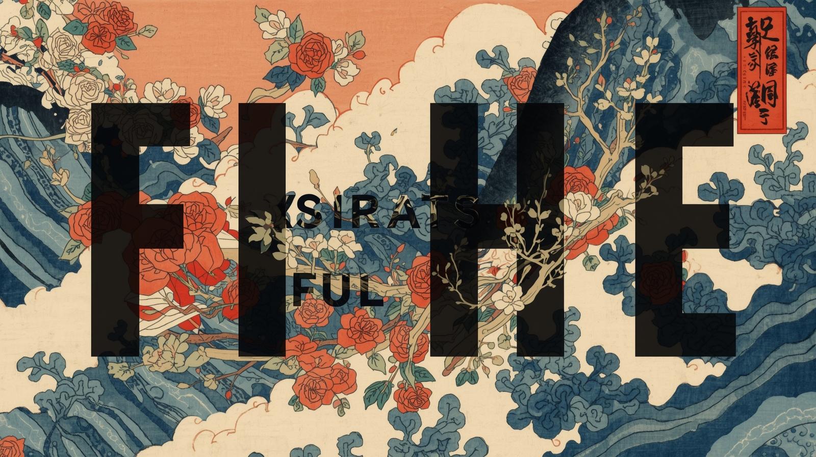
- Insufficient Contrast: Placing text over a complex, high-detail AI generation without a “Backdrop Filter” or shadow logic to separate the two.
- Ignoring the Audience: Using a futuristic, “Cyberpunk” font for a “Traditional Zen” theme, creating a logical disconnect that breaks the viewer’s immersion.
5. Conclusion: Style Attracts the Eye, Readability Respects the Mind
The most successful typography is like a transparent window: it allows the viewer to see the message clearly while adding its own subtle tint to the experience.
At KOSAKI DESIGN ART, we believe that every letter is a masterpiece of engineering.
By balancing the science of cognitive reading with the soul of artistic style, we create a World Digital Atelier where the “Taroko Gorge” experience begins the moment you read the first word.
We invite you to explore a world where art and information live in perfect harmony. Experience the precision of our layouts and find a masterpiece that speaks to both your eyes and your intellect.
Experience the Art of Information
Visit the KOSAKI DESIGN ART SHOP today. Explore our collection of 100+ digital works where every pixel—and every letter—is engineered for excellence.