Color is the first thing a viewer “feels” before they even recognize the subject of an artwork.
In the high-velocity digital landscape, where the human attention span has become a scarce commodity, mastering color is the difference between a fleeting scroll-past and a deep, lasting emotional connection.
At KOSAKI DESIGN ART, we treat color not as a mere decorative choice, but as a strategic communication system.
This article serves as a masterclass in the “Bionic” approach to color—bridging the cold logic of light physics with the warm complexity of human emotion.
Whether you are a collector looking to understand the value of a digital masterpiece or a creator seeking to elevate your work, understanding the silent language of the palette is essential.
By the end of this guide, you will see the digital canvas not just as a collection of pixels, but as a playground for psychological engineering.
- 1. The Fundamentals: The Digital Color Wheel and the Logic of Harmony
- 2. Color Psychology: Engineering the Viewer’s Mood
- 3. Cultural Color Theory: The KOSAKI Aesthetic
- 4. Technical Mastery: Managing Color in the Bionic Era
- 5. Case Study: The Emotional Impact of Taroko Ocean(KDA000002)
- 6. Conclusion: The Artist as the Orchestrator of Light
1. The Fundamentals: The Digital Color Wheel and the Logic of Harmony
Before we can manipulate emotions, we must understand the “Engineering” of color.
The relationship between hues is governed by mathematical principles.
In the digital realm, we primarily work with the RGB (Red, Green, Blue) light model, which differs significantly from the traditional CMYK pigment model used in physical printing.
Understanding this distinction is the first step toward technical mastery.
Primary, Secondary, and Tertiary Systems
The color wheel is a logical map of relationships.
Primary colors are the anchors, secondary colors are the bridges, and tertiary colors provide the nuance.
At our atelier, we use these relationships to create “Visual Anchors.”
By placing a high-contrast secondary color against a muted primary base, we can direct the viewer’s eye with surgical precision.
This is the foundation of Compositional Logic.
The Mathematics of Harmony
Beauty is often a result of mathematical balance.
We utilize four primary types of harmony to create specific emotional states:
Monochromatic for elegance and focus; Analogous for comfort and natural flow; Complementary for high energy and visual tension; and Triadic for vibrant, structured balance.
Every piece in our “Fusion of AI, Abstract, and Ukiyo-e” collection is engineered using one of these harmonic frameworks to ensure visual stability.
2. Color Psychology: Engineering the Viewer’s Mood
Every hue on the spectrum triggers a specific biochemical response in the human brain.
In the art scene, “Color Grading” has become a form of psychological architecture.
We don’t just choose a color because it looks “good”; we choose it because of how it makes the collector feel in their living or workspace.
The Energy of Warm Tones
Red is the color of urgency, passion, and traditional Japanese vitality. It draws the eye faster than any other color.
Yellow represents optimism and the digital clarity of the future. When we use these tones in our abstract works, we are aiming to energize the environment, making them perfect for creative offices or social spaces.
The Tranquility of Cool Tones
Blue is the pillar of trust, technology, and the infinite horizon. It lowers the heart rate and promotes contemplative thought.
Green acts as the bridge between our digital lives and the natural world.
At KOSAKI DESIGN, we often utilize these cool tones to create a sense of “Futuristic Tranquility,” allowing digital art to act as a window into a calmer world.
3. Cultural Color Theory: The KOSAKI Aesthetic
What sets KOSAKI DESIGN ART apart is our fusion of global technology and Japanese traditional palettes.
We believe that history provides a “Color Logic” that modern AI often lacks.
By training our systems on historical pigments, we achieve a look that is both cutting-edge and timeless.
Aizuri-e (The Logic of Indigo)
The “Indigo” blue used in traditional Ukiyo-e is more than just a pigment; it is a cultural signature.
In our digital works, we use “Digital Indigo” to evoke a sense of deep nostalgia.
It is a color that feels both ancient and like the deep space of the future.
The “Dirty” Palette and Wabi-Sabi
One common mistake in digital art is “Over-Saturation.”
Pure digital colors can feel cheap and artificial. We utilize the Wabi-Sabi principle of the “Dirty Palette”—intentionally desaturating and adding “grayness” to our hues.
This mimics natural pigments and makes the art feel “organic” and “expensive.”
This subtle shift in saturation is what gives our 100+ digital art pieces their premium, gallery-grade quality.
4. Technical Mastery: Managing Color in the Bionic Era
To reach our primary goal of collector satisfaction, we must ensure that our “Emotional Impact” remains consistent across all devices, from smartphone screens to high-end spatial computing headsets.
The 60-30-10 Rule of Composition
We apply a strict engineering formula to our color distribution: 60% Dominant Color (setting the mood), 30% Secondary Color (providing structure), and 10% Accent Color (the emotional “spark”).
This formula ensures that even our most complex abstract pieces remain digestible and emotionally clear to the viewer.
Color Grading via Neural Manifolds
We don’t just “filter” images.
We use AI-driven Neural Grading to harmonize the color output of our collaborative models.
This allows us to maintain a consistent “KOSAKI Signature” across diverse styles.
Whether it is an abstract wave or a geometric city-scape, the color logic remains unified, creating a cohesive brand experience for our global audience.
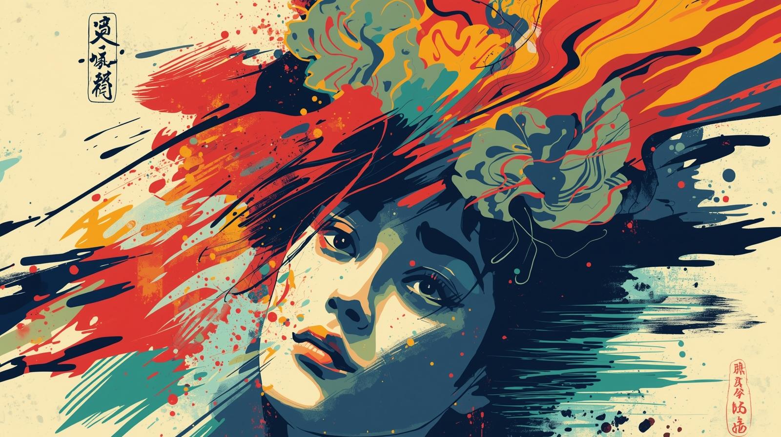
5. Case Study: The Emotional Impact of Taroko Ocean(KDA000002)
Let’s analyze one of our flagship pieces, Taroko Ocean(KDA000002). The goal for this piece was “Nostalgic Innovation.”
We started with a deep Indigo analogous base to provide a sense of calm and history.
We then introduced a sharp, triadic accent of Vermillion—a color traditionally used in Japanese paint—to symbolize the spark of modern IT engineering.
The Results of Strategic Color Choice
The combination of calm blues and high-energy reds creates a “Push-Pull” emotional effect.
Collectors have noted that the piece feels “alive” yet “grounded.”
This emotional resonance is precisely why Taroko Ocean(KDA000002) remains one of our most discussed items in the shop.
It is a testament to the fact that when color theory is applied with logic, the impact is undeniable.
6. Conclusion: The Artist as the Orchestrator of Light
Color is not just an aesthetic choice; it is a Communication Tool.
In the digital age, being an artist means being an orchestrator of light and emotion.
By combining the rigid science of color harmony with the fluid sensitivity of Japanese aesthetics, we create art that does more than decorate a room—it changes the way a person feels within it.
As we continue to expand the World Digital Atelier, our commitment to “Emotional Engineering” remains our guiding light.
We invite you to explore our collection and find the color story that resonates with your personal future.
Experience the Palette of the Future
Visit the KOSAKI DESIGN ART SHOP today. Explore over 100 digital masterpieces where traditional Ukiyo-e soul meets the bionic precision of color technology.
Would you like me to help you create a “Color Palette Guide” for one of your favorite pieces, or should we move on to a Tutorial on how to set up color grading for your next digital illustration?